In particular, I want gigantic trousers.
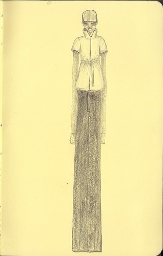
I'll probably end up looking more like this though:

I think I first started liking the idea in 2004 when I began looking at runway collections, and was struck by the voluminous trousers that seemed to be a recurring theme in Vivienne Westwood MAN shows, and Vivienne's collections in general.

Then, there was a big pair of grey Viktor and Rolf Monsieur trousers in the F/W 06/07 collection, that just seemed to move, even in photo.

I think my attraction to them comes from the movement and fluidity they present.
I think this is an element of clothing that hasn't been present in mainstream menswear for a while since everyone has been following Slimane's lead on the slim silhouette...although the last seasons' collections seem to be showing we are now deviating from this silhouette, while not entirely abandoning it. Prime examples being Damir Doma, Rick Owens, Giuliano Fujiwara and Yohji Yamamoto (who never really strayed from his signature refined, yet slouchy silhouette).
Even Slimane himself experimented with the idea of juxtaposing the slouchy with the skinny in his time at Dior, sending perfect figured boys down the runway in cropped, skinny jackets and floor length pleated skirts and sneakers.

A move truly ahead of its time, as we are only starting to see this idea being adapted by more designers now, and the issue of men in skirts burning up virtually every fashion related site on this wonderful world wide web.
The idea of layering and juxtaposing skinny or structured with flowing or free is also something that works in varying degrees in architecture.
One example where is does not work very well, is Southern Cross Station in Melbourne.
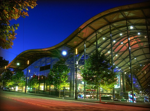
While from the street front, this station, which was a first in Australia both in technological innovation (using an undulating roof with membrane system that was intended to filter the polluted air as it passed out through the roof instead of stinking up the air in the station), and form (Melbourne is probably the most experimental city, architecturally, in Australia, and even then, in the broader context of Australia as a nation, many of the buildings are poorly received and highly criticized) seems quite light, in person, the edges of the roof on the majority of facades has a depth too considerable to give it the lightness such a free flowing roof canopy begs to have. The internal structure consisting of an intensely dense grid of thick pillars erupting from the middle of train platforms from which undulating trusses with large depths sprout provides a clutter that detracts from the potential lightness that the overall form suggests.

On the contrary, a facade system that uses the containment of an element seemingly frozen in time, that works very well (and is a constant source of inspiration for myself) is Dior Omotesando by SANAA, who, I must add, recently won this year's Pritzker Prize, and absolutely deserve it!
Perhaps this building's success lies in that the limiting element, the glass on either side of the plastic element, does not compete with the rippling plastic, but rather just defines parameters in which it exists.

All the elements inside are white also, as though they are trying to be non existent so as not to detract from the lightness created by the shimmering translucency of the facade system.
There are also some good examples popping up in design competitions lately. One is for the main tower of the University of Technology in Sydney competition, proposed by LAVA. Titled Enviro Skin, it suggests covering the entire building with a membrane fabric that allows for a cavity between the new and existing structures as a means of passively cooling and heating the entire existing building, while allowing for a decorative lighting scheme that is both able to be manipulated and unseen in Sydney. It would be both a forward move aesthetically and technologically for Sydney, quite a conventional city.

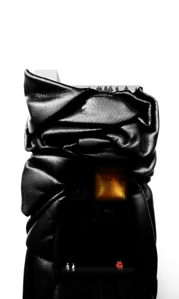
Another competition currently making design blog news is for the Fashion Museum on Omotesadno Dori in Tokyo.
This design by Abre Etteh, which received an "honorable mention" wraps the entire building in a black, vacuum formed rubber membrane, adding a really bizarre silhouette to the overall building, creating what would appear to be a normal rectangular office block, but then this membrane bulges and tucks and pulls and bends, giving the entire thing an incredibly awkward softness largely unprecendented in the language of architecture, yet familiar within the realm of fabric and fashion.
I suppose another aspect of this bag lady-esque layering of fabric is the distortion of the natural proportions of shape and the body. Sure, it can be used for the opposite like some of Vivienne Westwood's crinolines, bustles and corsets, enhancing curves and refining waist since the early nineties, but suggesting an alternative form to the human body is slightly unsettling and terribly fascinating.
Some early examples can be seen in Cristobal Balenciaga's work in the 1950s:
the sack dress,

the cocoon jacket...

...the later of which, was reinterpreted by Ghesquire for the fall/winter 09/10 men's collection a the "shell coat" (centre below)

The abstraction gets more or less extreme depending on which designer's collection you look at, and I'm sure I'll be thinking more about the idea soon, but it is this ballooned "egg" shape that I am currently really wanting from a jacket....exactly like Daul's McQueen, which she lovingly shows in the video below.
it's kind of like wearing a hoodie ad carrying a really saggy over sized backpack too.
But, I should stop, because i am sure i lost everyone about 17 paragraphs back...AND on the topic of eggs, will wish you a Happy Easter.
No comments:
Post a Comment